


What is the best or general font type to using in RESUME?
When creating a standout resume, even the smallest design decisions can have a big impact—especially your font and font size. While your experience and achievements are front and center, choosing the right font style and the best font size for resume readability shows attention to detail and professionalism. These subtle elements play a crucial role in making your resume easy to scan and visually appealing to hiring managers.
Recruiters typically spend only a few seconds skimming each resume. A clean, legible font and an optimal font size help ensure your information is noticed—not ignored. But navigating the world of professional resume fonts can be tricky. Some decorative typefaces and serif-heavy styles may look attractive but could compromise clarity or get misread by ATS (Applicant Tracking Systems).
If you're polishing your resume for a job search or simply want to refresh your layout, understanding what makes a resume ATS-friendly and recruiter-friendly is key. This guide will walk you through the essentials—from font choices to the ideal font size—so you can strike the perfect balance between style and substance.
Best Font and Font Size for a Resume
When choosing the best font for your resume, the goal is to strike the perfect balance between professionalism and readability. You want a font that looks polished, prints well, and is easy to scan on screen or paper. At the same time, your choice should help your resume stand out—but not for the wrong reasons.
Before getting into the top fonts to use, let’s quickly address one you should avoid at all costs: Comic Sans.
Sure, Comic Sans will get attention—but not in a good way. It's overly casual, unprofessional, and sends the wrong message to recruiters. Even if you're applying for a creative role, this font is best left out of any job application.
The Overused Default: Times New Roman, 12pt
Times New Roman at 12pt is a classic and safe option. It’s the go-to for many job seekers and technically acceptable. But because it's so common, using it won't help your resume stand out in a competitive job market.
If you want to elevate your layout while keeping things professional and ATS-friendly, here are some excellent alternatives to consider.
Best Fonts for Resume - Professional and Modern
Ubuntu
Ubuntu is a clean, modern typeface known for its humanist style and excellent readability. It works across industries, from creative to corporate, and looks sharp both on-screen and in print. Its unique shape ensures your resume feels fresh without sacrificing professionalism.
Roboto
Originally created by Google for Android, Roboto is a highly legible, contemporary font that's now widely used in digital and print design. It brings a tech-savvy vibe to your resume, but remains versatile enough for non-tech roles too.
Overpass
Inspired by Highway Gothic, Overpass is sleek, minimal, and refined. It’s ideal if you’re applying to more traditional industries, but its understated elegance makes it a strong choice for virtually any field.
Best Font Size for Resume
In general, the best font size for a resume is between 10 and 12 points for body text. This range ensures your content is easy to read without appearing cramped or oversized. Your name and section headings can be slightly larger (14–16pt for name; 12–14pt for headings) to create a clear hierarchy and help guide the reader’s eye.
Choosing the right font size helps with resume readability, improves ATS compatibility, and ensures your resume looks clean across all devices and file formats.

Understanding Fonts: The Foundation of a Great Resume Design
Before choosing the best font for your resume, it's important to understand the basics of font styles and why they matter. While selecting a font that looks good is a solid start, knowing the subtle differences between font types can help you create a layout that’s not only visually appealing but also highly readable and ATS-friendly.
Serif vs. Sans-Serif Fonts
One of the first choices you'll face is whether to go with a serif or sans-serif font. This decision plays a key role in shaping the tone and readability of your resume.
Serif Fonts
Serif fonts include small decorative lines (called serifs) at the ends of each letter stroke. Common examples include Times New Roman, Garamond, and Georgia. These fonts carry a more traditional, formal tone and are typically used in print. Their classic design can convey reliability, but they may not always display as cleanly on screens.
Sans-Serif Fonts
Sans-serif literally means “without serif.” These fonts offer a clean, modern look that enhances readability on digital platforms. Examples include Arial, Helvetica, and Calibri. Because of their simplicity, sans-serif fonts are often considered the most ATS-friendly and widely used in modern resume formats.
Exploring Font Families and Styles
Fonts fall into broader font families, each with unique traits that affect your resume’s overall appearance. Here’s a quick breakdown of a few more common styles:
Monospace Fonts
Every character in a monospace font takes up the same amount of space. While commonly used in coding or tech-related documents, fonts like Courier New, Lucida Console, and Monaco may look outdated in a resume unless you're applying for a developer or technical role.
Cursive Fonts
Designed to mimic handwriting, cursive fonts like Brush Script MT and Lucida Handwriting can feel personal or elegant. However, they're typically hard to read at a glance and are best avoided on professional resumes—except in limited use, such as in a creative portfolio section.
Fantasy or Decorative Fonts
These fonts, like Papyrus or Copperplate, are playful and attention-grabbing, but often difficult to read in large blocks of text. Save them for branding or personal logos, not resume content
Font Size and Spacing: Creating a Balanced Layout
Font choice is just one piece of the puzzle—font size and spacing are equally important for creating a polished and professional resume.
Best Font Size for Resume:
Use 10 to 12 points for your main content. This range ensures your resume is easy to read without looking cluttered or overly sparse.
For headings (such as section titles), you can go slightly larger—typically 14 to 16 points—to establish visual hierarchy.
Line and Paragraph Spacing:
Stick to 1.0 or 1.15 line spacing for body text to keep things compact yet legible. After each heading, use double line spacing to create clear separation between sections.
Letter Spacing (Tracking):
Avoid cramming too much text into tight spaces. Slightly adjusting letter spacing can improve readability and give your layout room to breathe—especially if you're using a narrow font.
By understanding how different fonts and formatting choices affect readability, professionalism, and ATS compatibility, you’ll be better equipped to design a resume that makes a great first impression.
Resume Layout Basics: Formatting That Gets You Noticed
A well-organized resume layout is essential if you want hiring managers—and Applicant Tracking Systems (ATS)—to scan your resume quickly and efficiently. Clean formatting improves readability, draws attention to your key achievements, and creates a professional first impression.
Here are the core resume formatting tips you need to follow:
Line Spacing
For the body of your resume, use 1.0 to 1.15 line spacing. This ensures your text isn’t too crowded or too spaced out. Add a double line space (or a clear visual break) after section headings to improve scannability. You can adjust spacing slightly depending on your content and how much room you need—but keep it consistent.
Bullet Points
Use bullet points in your work experience and skills sections to make information easy to skim. Stick to 3–6 concise bullet points per job—enough to highlight key achievements without overwhelming the reader. Each bullet should begin with a strong action verb and focus on impact.
Resume Length
One of the most common resume questions is: how long should a resume be?
- If you have less than 5 years of experience, aim for a one-page resume.
- For professionals with 5+ years of relevant experience, a two-page resume is perfectly acceptable.
- Three pages may be used in rare cases—typically for senior roles or technical CVs with extensive project portfolios.
Remember: clarity, relevance, and impact matter more than length.
Recommended Font Sizes by Section
Choosing the right font size for a resume is just as crucial as selecting the right font style. While there’s no single perfect size, standard best practices help ensure your resume looks professional, is easy to read, and passes through Applicant Tracking Systems (ATS) without issues.
Here’s a breakdown of recommended font sizes by section:
| Section | Recommended Font Size |
|---|---|
| Name | 14–16 pt |
| Headings | 11–12 pt |
| Body text | 10–11 pt |
| Contact information | 10–11 pt |
- Name (14–16 pt): Your name should stand out, but not dominate the page. A slightly larger, bold font works well.
- Section Headings (11–12 pt): Use a consistent style (such as bold or all caps) to organize content clearly.
- Body Text (10–11 pt): This is the ideal size for most of your resume content, including job descriptions and bullet points.
- Contact Information (10–11 pt): Use the same size as body text to maintain visual consistency and ensure it’s easy to locate.

PRO TIP
Maintain a 1–2 point difference between headings and body text for a clean, structured look.
Font Size by Resume Type
Depending on your resume format and the type of role you're applying for, slight adjustments in font size can help optimize readability and layout. Here's how to approach font sizing based on resume type:
One-Page Resume (Entry-Level or Students)
- Use 10–11 pt for body text to maximize space without compromising legibility.
- Adjust margins and line spacing (e.g., 1.0–1.15) to make everything fit cleanly.
Creative Resume (Design, Media, Marketing)
- You can go up to 12 pt for body text if your layout allows, but always prioritize readability.
- Combine slightly larger fonts with whitespace and minimal graphics for balance.
Technical Resume (IT, Engineering, Analytics)
- Stick to 10–11 pt to ensure clarity and consistency, especially with technical terms or certifications.
- Use monospace fonts only for code snippets or specialized sections.
ATS-Friendly Resume (General Professional Use)
- Use 10–12 pt for body content to stay within the safe range for ATS readability.
- Avoid fonts smaller than 10 pt or larger than 12 pt, as these may not parse correctly in some systems.
- Stick with standard, well-supported fonts like Calibri, Arial, or Georgia.
No matter your resume style or industry, the goal is the same: a clean, professional design that enhances readability and makes it easy for both recruiters and software to quickly find the most relevant information. Pair the right font size with consistent formatting, and you’ll ensure your resume makes the right impression from the very first glance.
Would you like help applying these formatting rules to a specific resume template or reviewing your current layout?
How JobHun Helps You Get Font Size and Formatting Right
Designing a professional, well-structured resume isn’t always straightforward—especially when you're juggling font choices, formatting rules, and trying to meet ATS requirements. That’s where JobHun comes in.
Our intelligent free resume builder is designed to take the guesswork out of formatting by automatically applying the best font sizes for each resume section, ensuring your document looks clean, consistent, and recruiter-ready.
With JobHun, you get:
- Pre-formatted resume templates built with optimal font sizes, spacing, and layout—no manual adjustments needed.
- AI-powered formatting suggestions to fine-tune your headings, spacing, and section hierarchy.
- ATS-friendly design defaults, so you don’t have to worry about compatibility issues.
- Responsive layout previews that show how your resume will appear on desktop and mobile, ensuring your text is readable on every screen.
- A simple, guided editing experience that helps you focus on content while we handle the formatting.
Whether you're creating your resume from scratch or uploading an existing one for improvement, JobHun ensures your formatting meets professional and technical standards—down to the font size.
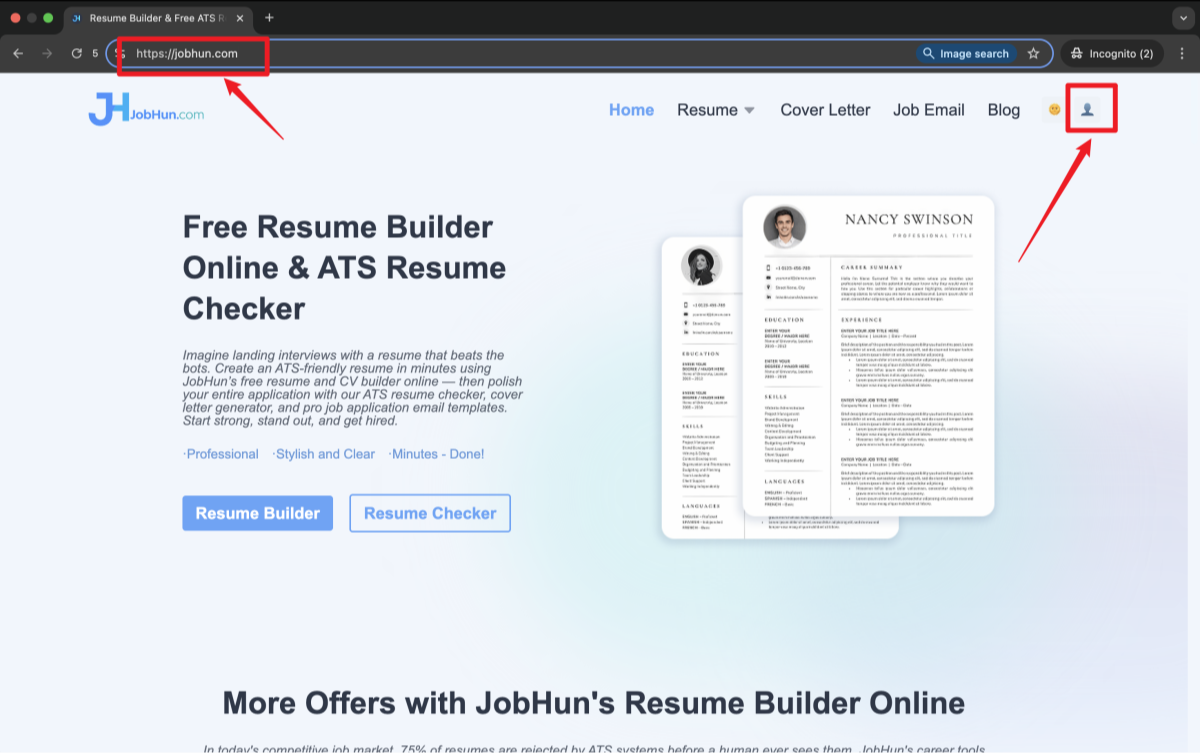
Go to the JobHun Website
Start by visiting JobHun.com.
Once you're on the homepage, click the 👤 profile icon in the upper-right corner. This will take you to JobHun’s resume builder web app.
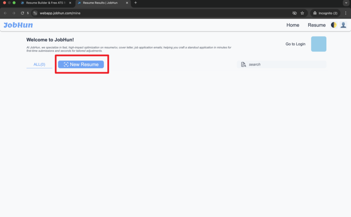
Access the Resume Dashboard
You’ll land on webapp.jobhun.com/mine.
If you’re not logged in yet, the site will prompt you to sign up or log in.
- Click the “New Resume” button, or
- Click “Go to Login” in the upper-right corner.
Either option will take you to the sign-in page.
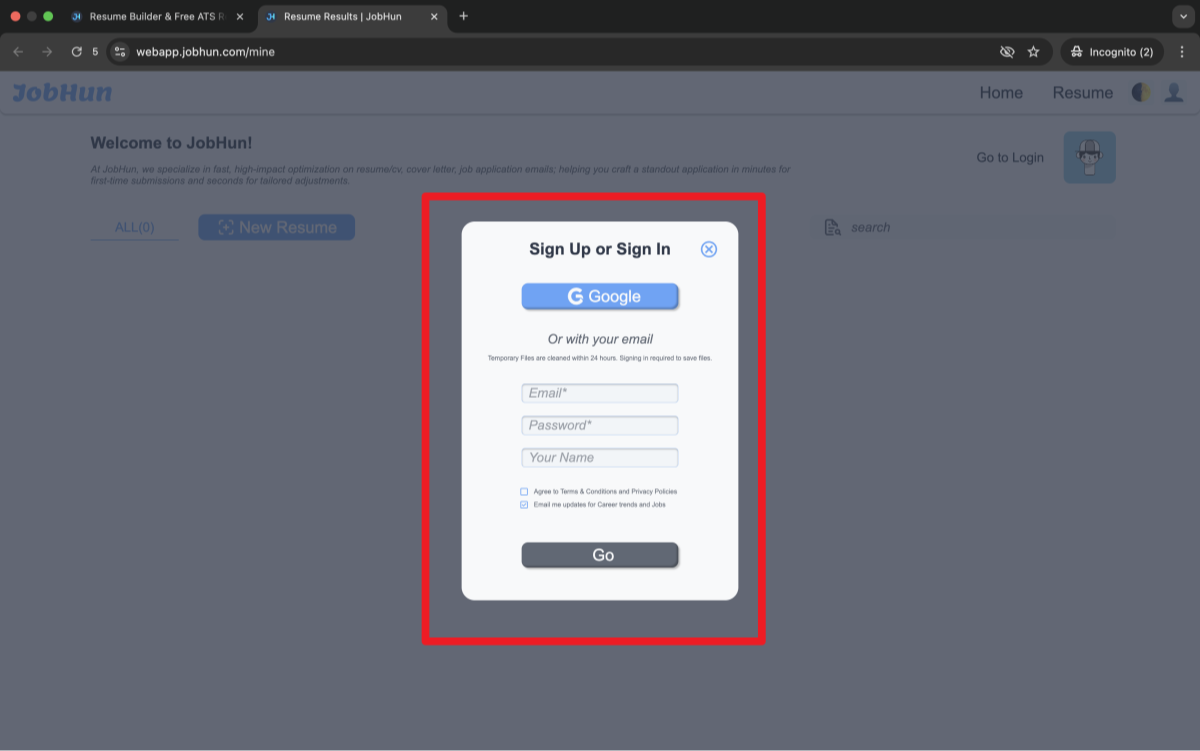
Sign Up or Log In to Your Account
You have two login options:
- Use your Google account for quick access
- Or manually enter your email, password, and name, then click “Go”
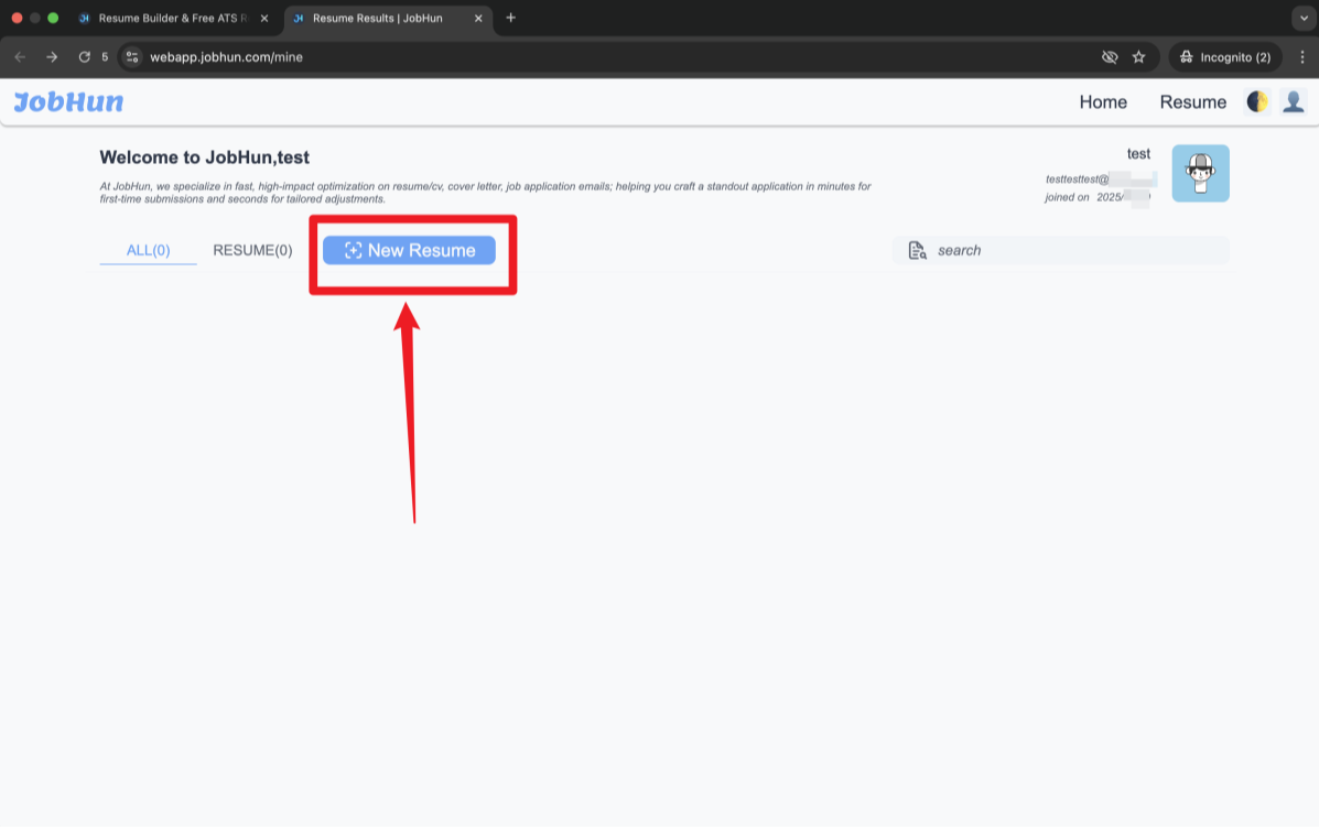
Once you're signed in, your personal dashboard will appear.
Click “New Resume” to Get Started
Now that you’re logged in, your profile details (name, email, join date) will show in the top-right corner.
Click the “New Resume” button again to open the AI resume builder.
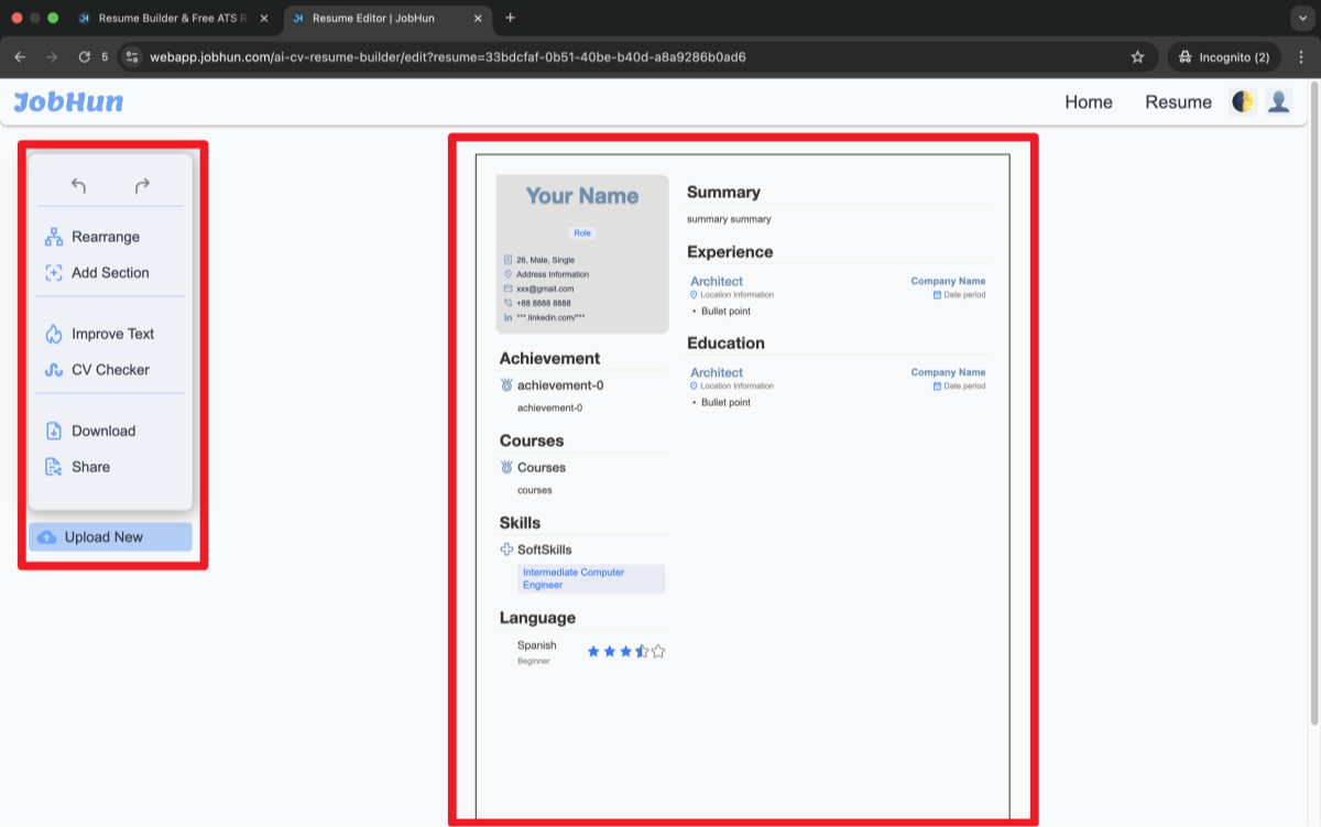
Build and Customize Your Resume
The resume builder layout is split into two main parts:
- Left panel: Your control dashboard, where you can add, edit, or organize resume sections (summary, experience, skills, etc.)
- Right panel: A live preview of your resume that updates as you make changes
You can now:
- Use AI to auto-generate resume content
- Manually edit each section
- Format, reorder, and polish until you're happy with the result
Builder vs. Manual Formatting: Tips for Word and Google Docs Users
Not a design expert? That’s completely fine. Whether you're using a resume builder or manually formatting in Word or Google Docs, you can still achieve a clean, professional layout with the right font size and formatting techniques.
Here’s how each method stacks up—and how to make the most of your tools:
Free Resume Builders (like JobHun)
Resume builders offer a streamlined way to format your resume without needing to worry about spacing, fonts, or layout structure.
- Pre-set font sizes follow industry standards—typically optimized for ATS readability.
- Sections like experience, skills, and education are already formatted for clarity and flow.
- Ideal if you’re short on time or unsure how to balance visual appeal with professional structure.
Using JobHun’s resume builder, you can instantly apply ATS-friendly fonts, appropriate sizes, and consistent section spacing—all without manual adjustments.
Microsoft Word
Prefer to build your resume from scratch? Word offers flexibility, but you’ll need to be mindful of consistency.
- Use the “Styles” tool to format headings, subheadings, and body text uniformly.
- Stick with standard fonts (e.g., Calibri, Georgia, Arial) and apply sizes as recommended:
- 14–16 pt for your name
- 11–12 pt for section headings
- 10–11 pt for body content
- Adjust line spacing to 1.0–1.15 for clean visual balance.
Google Docs
Google Docs is a great free alternative for resume building, especially for collaboration or cloud-based editing.
- Start with a professional resume template, but don’t assume it’s perfect out of the box.
- Double-check font types and sizes to make sure they align with formatting best practices.
- Avoid using tables or complex columns that may confuse ATS software.
PRO TIP
Once your resume is finalized, save it as a PDF to preserve your font sizes, spacing, and layout across devices. This ensures your resume looks the same on a recruiter’s screen as it does on yours—and protects your design from accidental formatting shifts.
Key Takeaways
Here’s your cheat sheet for font size success:
- Focus on readability: Use 10–11 pt for body text, 11–12 pt for headings, and 14–16 pt for your name.
- Adjust for your resume type: Tweak sizes slightly for one-pagers, creative, or tech resumes.
- Pick smart fonts: Pair with clean options like Calibri or Arial.
- Dodge mistakes: Avoid tiny text or too many size variations.
- Use tools if needed: Resume builders can simplify formatting.
Choosing the right font size might feel like a small detail, but it can make or break that crucial first impression. If formatting stresses you out, why not try a online resume builder? Many come with font size presets to take the guesswork away. Give it a go, and watch your resume transform into something recruiters can’t ignore.


